WordPress is one of the most commonly used tools for creating online stores, portfolios, and any type of website. This is so because it is free to use, open source, has an easy-to-use interface, and has a wide range of themes and plugins that result in seamless customization, scalability, and efficient website management for users of all skill levels.
WordPress has many page builders in its interface to help you build the perfect website that you require without needing to write a single line of code, making it accessible for beginners while still offering advanced features for developers.
WordPress, while popular, has drawbacks including security vulnerabilities due to its open-source nature and popularity, potential for performance issues with heavy plugins and themes, and the need for ongoing maintenance and updates.
Some of these drawbacks can be overlooked because of all the help you get by using its various page builders like Elementor, WPBakery, SeedProd, Brizy, and many more.
Top page builder that can be used for easy website building
- Elementor:
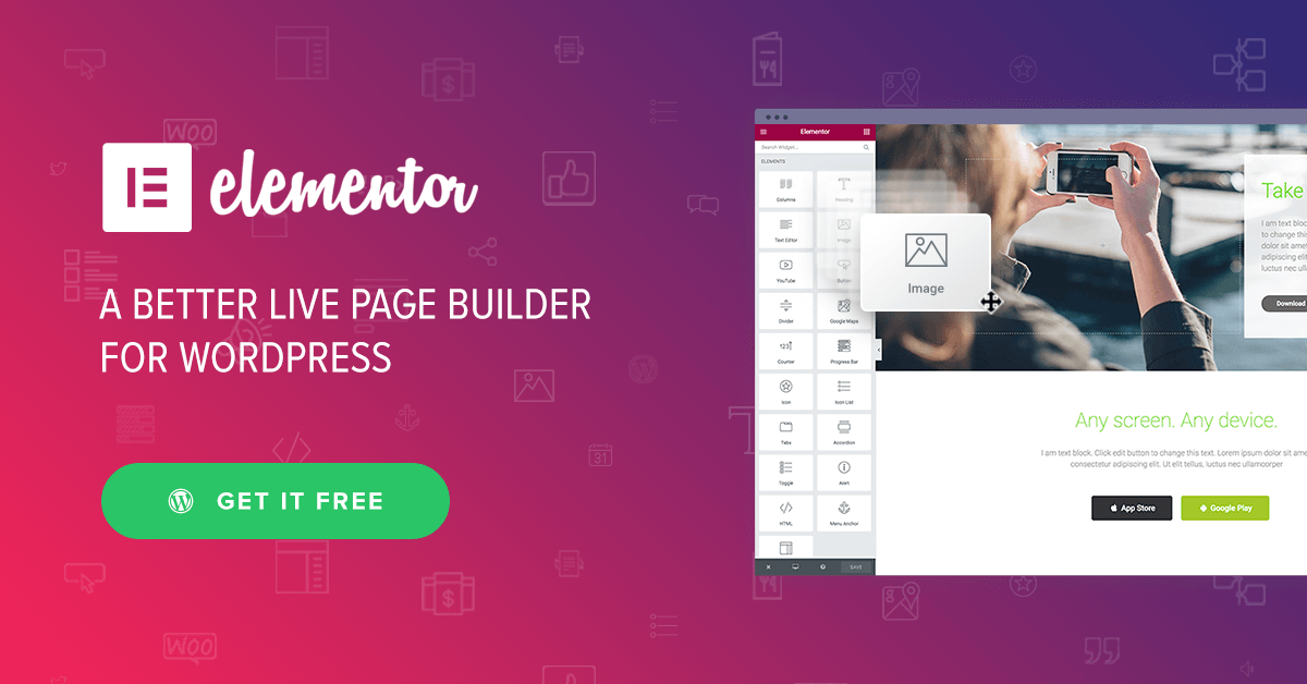
Elementor is one of the most popular WordPress page builders, having over ten million active installations.
The free version of Elementor would be enough for a basic website page. In case you require a high-end web page, it also provides various components in its paid version that make the page look stunning!!
A few key features of Elementor are:
- Drag & Drop Editor – Build every part of your website visually. Simply drag, drop and customize without writing a single line of code.
- 300+ Designer Made Templates – Choose a beautifully crafted template designed to fit every industry and need. It is always responsive and fully customizable.
- Responsive Editing – Adjust your website to make it look perfect on every screen and design for up to 7 devices.
A few drawbacks of Elementor are:
- Slow Load Times: – Elementor’s JavaScript-heavy nature and the addition of widgets and add-ons can significantly increase page load times.
- Compatibility Issues – Elementor can sometimes conflict with other plugins or themes, leading to errors or broken functionality.
- No Going Back – Elementor once integrated with the website, can not be removed. If removed, the website will break and will have to be built again.
- WPBakery:
WPBakery, while also being one of the most popular WordPress page builders, having over four million active installations, is simply an overly complicated and not so easy-to-use page builder with both features and flaws that cannot be overlooked.
There is no free version of WPBakery, only a premium version that can be installed after completing the payment of $69. This is the only payment that needs to be made for a lifetime license of the page builder (mentioned on their website).
From a personal experience, the payment of $69 is not worth it as compared to other page builders that provide basic functionality for free and even better experiences for a better price.
A few key features of WPBakery are:
- Wide range of design and theme templates – WPBakery provides a vast library of design elements and pre-built templates, streamlining the design process and allowing users to quickly create professional-looking pages.
- Responsive Design – Ensure your website looks great on any device with responsive design capabilities.
- SEO Toolkit – You can boost your website’s search engine ranking with built-in SEO features.
A few drawbacks of WPBakery are:
- Steeper learning curve – WPBakery can be more challenging for beginners compared to some other page builders, such as Elementor, due to its complex interface and reliance on shortcodes.
- Lack of inline editing – The absence of inline editing and right-click functionality can make editing and customizing page elements less convenient.
- Performance issues with complex layouts – WPBakery’s performance can be affected by complex layouts, especially when combined with multiple plugins, potentially leading to slower page loading times.
- Beaver Builder:

Beaver Builder is a powerful website builder that can be used to create any type of website, including blogs, eCommerce stores, and membership sites.
According to some research, Beaver Builder might just be the best drag and drop WordPress page builder plugin on the market. Same as Elementor, Beaver Builder offers a free version, along with several premium plans for users who need more advanced features.
While it does not have a dedicated SEO plugin, it can indirectly help improve your site’s SEO by offering flexibility and tools for building SEO-friendly content and layouts.
A few key features of Beaver Builder are:
- Pre-built templates and layouts – The plugin offers a variety of templates and layouts to get users started quickly and easily.
- SEO-friendly – The plugin is designed to be SEO-friendly, ensuring that websites built with it are easily indexed by search engines.
- User access control – The plugin allows developers to control which users have access to the page builder and which modules they can edit.
A few Drawbacks of Beaver Builder are:
- Compatibility Issues – Conflicts can arise between Beaver Builder and other plugins or theme updates, potentially affecting its functionality.
- Limited Advanced Features – Beaver Builder may lack some advanced features found in other page builders, such as global design templating.
- Lacks animations – Beaver Builder does provide animations for its components but lacks in comparison to its competitors.
- Visual Composer:
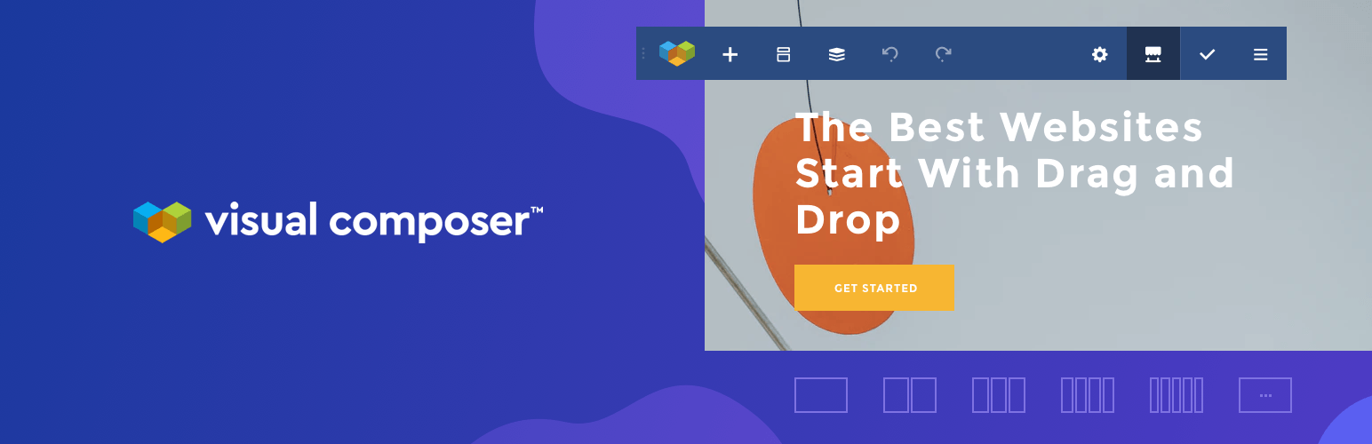
Visual Composer Website Builder is a live frontend drag and drop editor for WordPress that allows you to design pages and manage content.
Just like Beaver Builder, Visual Composer is also considered one of the best drag and drop page builders, but for developers and agencies needing precision, Visual Composer’s backend/frontend hybrid editor bridges gaps that Beaver Builder’s streamlined approach can’t—proving ‘simplest’ isn’t always ‘best’ for every workflow.
Its pricing starts the same as Elementor and Beaver Builder, with it being free for use for basic needs, and for more complex use, you may need to use its premium version.
A few key features of Beaver Builder are:
- Element lock – you can restrict element editing for specific user roles.
- Unsplash and GIPHY integration – these visual libraries give you easy access to numerous stock images and GIFs to feature on your page.
- Name your elements – Change default element names to navigate across your layout quickly.
A few drawbacks of Beaver Builder are:
- Performance – Visual Composer can significantly impact page load times, especially when using numerous add-ons or complex elements. This can negatively affect user experience and SEO, as search engines prioritize faster-loading websites.
- Stability Issues – Updates to Visual Composer might not always preserve the integrity of existing layouts and designs. This can lead to unexpected changes or issues with previously functional elements.
- Integration Challenges – While Visual Composer is generally compatible with many themes and plugins, it can sometimes make it difficult to integrate other tools or services into a website.
- Oxygen:
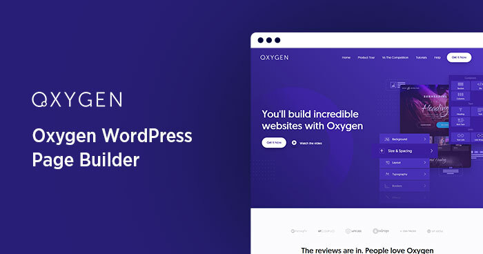
Oxygen acts as a visual site builder, allowing users to design and customize their websites with a drag-and-drop interface.
You can tweak your site components to the code level, as Oxygen supports HTML, CSS, JavaScript, and even PHP customization. Even better, the interface lets you preview the output of your code directly.
Oxygen does not have a free version; it only provides a single plan that is a lifetime license for $199.50 (currently)
A few key features of Beaver Builder are:
- Dynamic Content – Displaying dynamic content from sources like blogs, stores, or other databases is easy with Oxygen’s Dynamic Data features.
- Advanced Queries – Use advanced query syntax to create more complex and useful search results.
- Oxygen and Gutenberg Editor Integration – Oxygen works seamlessly with the Gutenberg editor, allowing you to build entire sites or create custom elements within the Gutenberg environment.
A few Drawbacks of Beaver Builder are:
- Steep Learning Curve – Oxygen Builder’s advanced features and developer-centric approach can be overwhelming for users new to WordPress or page builders.
- Complex UI – The user interface might be more complex than some other builders, making it less intuitive for non-developers.
- Not Client-Friendly – Some users find Oxygen Builder less client-friendly than other page builders due to its advanced features and potential for complex customizations.
Which WordPress page builder should you choose?
The WordPress page builder that you should choose depends on the type of website or page you want to create.
If you just want basic blog pages or a basic landing page, then Elementor is the best choice for you because its free version is good enough for blogs and basic use while also being easy to learn.
If you want to develop a complete website and need complex coding to make your website go to the next level, then you can use Oxygen page builder because it allows you to change your components on the code level.